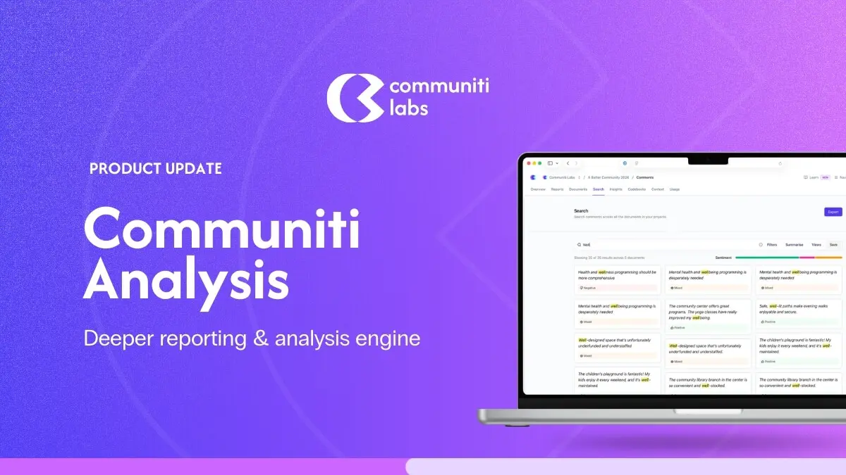
February 2026: What's New in Communiti Analysis
February was all about making Communiti Analysis more visual, more reliable, and more transparent. Because you shouldn't have to fight your tools.

Dan Ferguson
Founder
We've got a meaty update for you this month. February was all about making Communiti Analysis more visual, more reliable, and more transparent; because when you're working with community feedback, you shouldn't have to fight your tools to get to the insights.
Here's what's new and, more importantly, why we built it.
See the Bigger Picture with New Visualisations
What we built: A suite of interactive visualisations across your projects, documents, themes, and folders, including an Embedding Explorer (a 2D scatter plot of how your data relates), Theme Similarity Networks, Document Similarity Matrices, Sentiment Flow Timelines, Co-occurrence Heatmaps, and an Outlier Detection Panel.
Why it matters: When you're analysing hundreds or thousands of community responses, reading lists of themes and topics only gets you so far. We kept hearing from teams that they wanted to see the relationships; which themes cluster together, which documents are saying similar things, where sentiment shifts across a conversation.
These visualisations give you that bird's-eye view so you can spot patterns, identify gaps, and tell a richer story about what your community is saying. Whether you're presenting to councillors or writing up a What We Heard report, being able to show these connections visually makes your analysis more compelling and easier to defend.
Faster, Smarter Reports
What we built: Report generation now runs each section in parallel (instead of one at a time), and we've added intelligent context management so each section pulls in the most relevant evidence automatically.
Why it matters: We know that turnaround time on engagement reports is a constant pressure. Every day between closing a consultation and delivering insights is a day your community is waiting to hear back. By generating report sections simultaneously and being smarter about which evidence gets prioritised, your reports are not only faster, they're higher quality.
The system now surfaces the most relevant citations first, so your reports are grounded in the strongest evidence without you having to manually curate it.
Smarter Citation Ranking
What we built: Citations are now automatically scored by relevance to each theme, so the most important evidence surfaces first.
Why it matters: Not all citations are created equal. When your report references community feedback, the quotes and data points that best represent a theme should be front and centre.
This is especially important for defensible reporting: when stakeholders or decision-makers question a finding, you want the strongest evidence right there, not buried three pages down.
Clearer Feedback When Uploads Hit a Snag
What we built: Specific, human-readable error messages for common upload issues, like an image with no extractable text, a video with no speech detected, or a spreadsheet with missing columns.
Why it matters: Previously, when something went wrong during document processing, you'd get a generic error that wasn't particularly helpful. Now you'll know exactly what happened and can take action, re-upload a clearer scan, check your spreadsheet formatting, or skip a file that isn't going to yield useful data. No more guessing.
Know When Your Topics Need a Closer Look
What we built: A notice that appears when the system's topic grouping produces partial results, showing you exactly how many responses were grouped and how many weren't.
Why it matters: AI-powered topic clustering is powerful, but it's not magic. Sometimes, especially with very diverse or small datasets, not all responses can be meaningfully grouped. Instead of leaving you to wonder why some feedback seems missing from your topics, we now tell you upfront.
This helps you decide whether to adjust your approach, add more context, or simply note the limitation in your reporting. Transparency builds trust.
Retry When Things Go Wrong in Quick Create
What we built: A retry button that appears if theme or report generation fails during Quick Create, so you can try again without starting over.
Why it matters: Quick Create is designed to get you from upload to report as fast as possible. But sometimes things go sideways, a timeout, a temporary issue, a tricky dataset. Previously, a failure in Quick Create could leave you stuck with no way forward. Now you can simply hit retry and pick up right where things left off.
Spot Your File Types at a Glance
What we built: Distinct icons and colours for each document type in your documents list; text files, images, videos, and spreadsheets each get their own look.
Why it matters: When you're managing a project with dozens of different source files - survey exports, photos from site visits, video recordings of community meetings, transcript PDFs - being able to quickly scan and identify what's what saves time and reduces confusion.
More File Formats Supported
What we built: You can now upload WebM video files, and GIF images are supported on cards.
Why it matters: Community engagement generates content in all sorts of formats. We're making sure Communiti Analysis can handle whatever your team throws at it.
Reliability and Quality Improvements
Beyond the headline features, we've also made a stack of under-the-hood improvements:
Faster document reprocessing: reprocessing a document now happens in the background instead of making you wait, so no more timeouts on large files.
Better keyboard accessibility: all interactive elements are now fully keyboard-navigable, making the platform more accessible for everyone.
Faster page loads: we've optimised how animations and components load for snappier navigation.
Quick Create ETA: you now see an estimated time remaining during Quick Create so you know what to expect.
Bug Fixes
We've also knocked out a bunch of issues that were causing friction:
Word exports fixed: theme names, citations in list items, and part references all display correctly now instead of showing raw codes.
Quick Create no longer gets stuck: if something fails, you'll get a clear message and a way to continue instead of a permanently spinning wheel.
Large image uploads fixed: oversized images are now automatically resized during processing so they don't fail.
Citation formatting fixed: no more doubled-up quotation marks around citations.
Spreadsheet processing fixed: documents with many columns no longer time out during processing.
Report progress indicator fixed: the timeline now correctly shows a spinner during theme processing.
What's Coming Next
We're not slowing down. We've got some exciting things in the pipeline that we can't wait to share with you. As always, if there's something you'd love to see in Communiti Analysis, reach out! Your feedback directly shapes what we build.
Thanks for being part of the journey. ❤️