We Sweat The Details: Communiti Conversations
Ahead of tomorrow's launch of Communiti Conversations, here's a look at the research behind every design detail in our new engagement platform.

Dan Ferguson
Founder
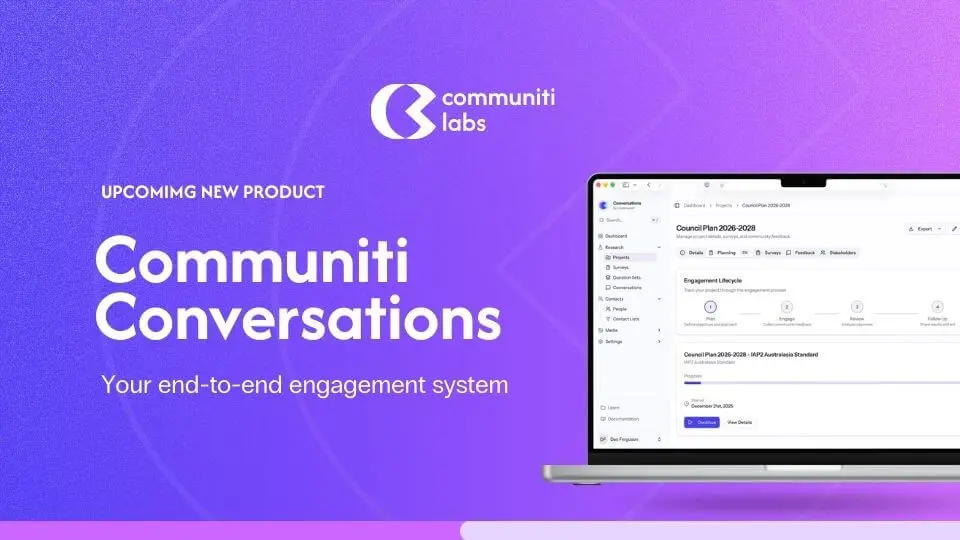
We're quietly launching something tomorrow that we've been working on for a long time. It's called Communiti Conversations, an end-to-end community engagement platform, and honestly, I'm both nervous and excited to get it into people's hands.
But this isn't the big announcement post. That's coming. Today I want to talk about something different. I want to talk about why a survey question has 18 pixels of padding beneath it. Why our progress indicators don't show percentages. Why we don't use sliders.
Because we sweated every single one of these details. And not because we're obsessive (okay, maybe a little), but because the research told us to.
When you're building a platform that helps councils and utilities hear from their communities, there's an uncomfortable truth you have to sit with early on: most people don't finish surveys. They click the link, they see a wall of questions, and they leave. And the people who do finish? By question 30, they're just clicking through to get it over with. The data you collect at the end of a long survey is measurably worse than the data at the start.
So we started from a pretty simple question: what does the research actually say about how to design surveys that people want to complete, and that produce data worth acting on?
Turns out, there's a lot of research. And a lot of it contradicts the "best practices" that most survey platforms just copy from each other.
Here's what we found, and what we did about it.
One question per page? All questions on one page? Neither.
This was one of the first decisions we had to make, and it's one that every survey platform answers differently.
The academic literature is pretty clear: showing one question at a time doesn't actually improve completion rates on desktop. Peytchev, Couper, McCabe, and Crawford tested this with over 21,000 respondents back in 2006 and found essentially no difference in completion between paging and scrolling. But, and this is the important part, they did find that scrolling designs produced more skipped questions and more "don't know" responses. People were scrolling past things.
On mobile, the picture flips. Mavletova and Couper (2014) found that scrolling designs on mobile were faster, caused fewer technical headaches, and respondents actually preferred them.
So what's the answer? Groups of 4–5 related questions per page. Toepoel, Das, and Van Soest (2009) tested groupings ranging from 1 to 40 items per screen and recommended exactly this range. It's enough questions to feel like you're making progress, few enough that nothing gets lost off the bottom of the screen, and it works on both desktop and mobile.
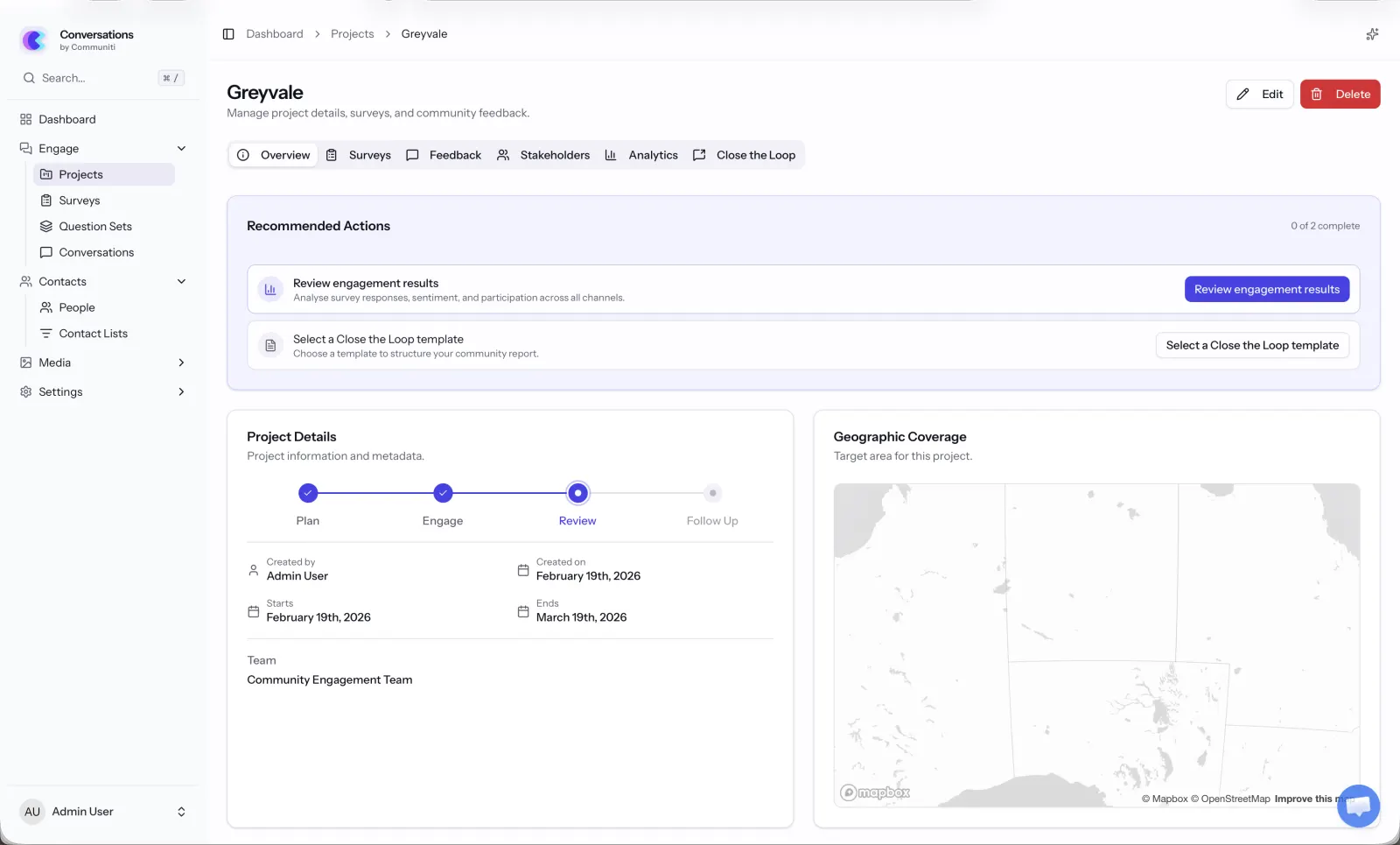
That's what Communiti Conversations does. We group questions by topic, so if a council is asking about a new park design, all the park-related questions sit together on one page. It feels natural, and it means each page has a clear purpose. When you move to the next page, you know you're moving to a new topic, not just the next random question.
There's a practical benefit too: when someone drops out halfway through (it happens, we're realists), we've already captured their responses from every completed page. With a single-page scrolling design, you'd lose everything.
We almost added a progress bar. Then we read the research.
This one genuinely surprised us.
Progress bars seem like such an obviously good idea, right? Show people how far along they are, they'll feel motivated to finish. That's what we assumed.
Then we read Villar, Callegaro, and Yang's 2013 meta-analysis of 32 randomised experiments on progress indicators. The finding? Linear progress bars don't significantly reduce dropout. And in many cases, they make things worse.
Here's why: Conrad, Couper, Tourangeau, and Peytchev (2010) found that when progress starts slow and speeds up later, 22% of people dropped out. When there was no progress bar at all? Only 13%. The progress bar was literally doubling the dropout rate.
Liu and Wronski (2018) confirmed this at scale, across 25,000+ real-world surveys on SurveyMonkey, surveys without progress bars had higher completion rates than those with them.
The mechanism makes sense when you think about it. If someone's on page 2 of 15 and they see "13% complete," they do the maths and think "this is going to take forever." You've basically told them how much pain is left. Yan et al. (2011) called this the "knowledge cuts both ways" effect, progress feedback helps when things are going better than expected, but actively hurts when they're going worse.
So here's what we did: no percentage. No "Page X of Y." No numbers at all. Instead, we show a subtle visual indicator at the bottom of the page (not the top, SurveyMonkey's own A/B testing found top-placed bars reduced completion) that gives a general sense of progress without the maths. And we engineered it to move faster at the start, because the research shows fast-to-slow progress curves produce the lowest dropout rates.
It's a small thing. You probably won't even notice it. That's kind of the point.
No sliders. Full stop.
I'll be honest... sliders look cool. They feel modern and interactive. Every time we demoed early mockups with sliders, people said "oh that's nice."
Then we looked at the data.
Funke, Reips, and Thomas (2011) found that slider scales produce 6.9 times higher dropout odds than radio buttons. Not 6.9% higher. 6.9 times. The effect is worst among people with lower digital literacy, exactly the kind of broad community demographic that council surveys need to reach.
Bosch et al. (2019) tested whether sliders at least produce better quality data to justify the pain. They don't. Measurement reliability and validity were comparable to radio buttons. Their conclusion was essentially: there's no reason to use sliders.
So we use radio buttons. They're familiar, they work on every device, and they don't make anyone's grandma feel like she's failed a computer test. We've styled them nicely, they don't look like a 2003 government form, but under the hood, they're plain, accessible, reliable radio buttons.
18 pixels of font size (and why your nan can read our surveys)
Community engagement isn't just for people who are comfortable with technology. It's for the 78-year-old who's lived in the neighbourhood for 50 years and has strong opinions about the new roundabout. It's for the parent filling it out on their phone while their kid eats dinner. It's for people with low vision, dyslexia, or English as a second language.
Rello, Pielot, and Marcos (2016) ran an eye-tracking study with 104 participants and found that reading comprehension improved continuously as font size increased up to 18pt. Anything below 14pt actively hurt understanding. Bernard and Mills at Wichita State found 14pt was the minimum for comfortable reading online, while accessibility guidelines for older populations recommend 18–20px.
Our body text is 18px. It might feel a little bigger than what you're used to on other platforms, but that's intentional.
We also went with sans-serif fonts. The serif vs sans-serif debate has been going for decades, but for screens the evidence is pretty settled: Vecino et al. (2022) found no meaningful difference for most people, but Russell-Minda's review found sans-serif fonts are significantly more readable for people with low vision, and Rello and Baeza-Yates (2013) confirmed the same for people with dyslexia. When you're designing for everyone, you go with the option that doesn't exclude anyone.
Line spacing is set at 1.4×. Line length stays between 45–90 characters. Left-aligned, never justified. Bold for emphasis, never italics (which are 18% harder to read according to the research). Contrast ratios meet WCAG AAA standards at 7:1.
None of this is glamorous work. But it means everyone in the community can actually read the thing.
Mobile isn't a nice-to-have. It's where your community is.
Here's a stat that should scare any engagement professional: Couper, Antoun, and Mavletova (2017) found mobile breakoff rates are 2–3 times higher than desktop when surveys aren't optimised for mobile. We're talking 24% dropout on unoptimised mobile versus 9% on desktop.
Optimising for mobile cuts that to around 13%, still higher than desktop, but a massive improvement. And here's the thing: the people you reach on mobile tend to be younger, more diverse, and harder to reach through traditional engagement channels (Antoun, 2015). These are exactly the voices that are usually missing from community consultation.
So every single interaction in Communiti Conversations is mobile-first. Touch targets are at least 44×44 pixels (Apple's HIG minimum). Matrix grids automatically convert to individual questions on smaller screens. Open-ended text fields are appropriately sized for thumb typing. Page loads are minimal because mobile connections can be patchy.
We also kept mobile survey duration in mind. Desktop surveys can hold attention for about 10–12 minutes, but on mobile, significant dropout kicks in after about 9 minutes (SurveySparrow). Our recommended survey template is designed to be completable in under 7 minutes on any device.
We don't force you to answer. (And the research says we shouldn't.)
"Required field" asterisks everywhere. Can't move forward until you've answered every question. We've all been there, and we've all rage-quit a survey because of it.
Heinz et al. (2015) confirmed what we all intuitively know: forcing responses increases dropout and decreases answer quality. People have legitimate reasons for skipping questions, maybe it's too personal, maybe it doesn't apply to them, maybe they genuinely don't know. Blocking them creates frustration and, perversely, produces worse data because people just select random answers to get past the gate.
Instead, we use soft prompts. If you skip a question and hit next, you'll see a gentle nudge: "You haven't answered this question yet, would you like to go back?" DeRouvray and Couper (2002) showed this approach reduces skipped questions without the downsides of forcing.
And for sensitive questions, which come up in community engagement more than you might think, we always include a "Prefer not to answer" option. It's more respectful, and it gives you clean data that distinguishes "I chose not to answer" from "I forgot to answer."
The little things that add up
There are dozens of other details I could bore you with, but here's a quick run through some of the less obvious ones:
Single-column layout. Baymard Institute found single-column forms improve completion by 15.4% over multi-column. We never put questions side by side.
Inline validation that doesn't nag. Wroblewski and Etre (2009) found inline validation can boost success rates by 22%, but only when it's done right. We follow the "reward early, punish late" pattern, you get an immediate green tick when something's correct, but error messages wait until you try to submit. No red warnings while you're still typing.
Back buttons. Some platforms remove them, worried people will change their answers. A PROMIS study of 807 participants found back buttons don't affect dropout rates and actually reduce careless responding. We keep them.
Co-branding with your organisation. Practitioner data shows branded surveys from recognised organisations see 20–30% higher engagement than generic ones. When a council sends out a Communiti Conversations survey, it looks like it's from the council, because it is. Their logo, their colours, their name. We're just the engine underneath.
5- and 7-point scales, fully labelled. Krosnick and Tahk's meta-analysis of 706 reliability tests found these are the sweet spots. Every point gets a text label, because Tourangeau et al. (2009) showed that unlabelled scale points let colour and position do the talking instead of the respondent's actual opinion.
Why this matters
I started Communiti Labs because I saw what happens when community engagement goes wrong. During the Black Summer bushfires in 2020, I started a charity to connect displaced people with temporary accommodation, and I saw firsthand how engagement can either bring a community together or tear it apart.
The councils, utilities, and energy companies we work with aren't surveying people for fun. They're making real decisions about infrastructure, services, and policies that affect real lives. The quality of the data they collect directly affects the quality of those decisions.
Every detail in Communiti Conversations, from the 18px font to the soft validation prompts to the carefully engineered progress indicator, exists because we asked one question: does the research say this will help more people have their say, and will the data be worth acting on?
If the answer was yes, we built it. If the answer was no, we didn't, no matter how cool it looked in a mockup.
Communiti Conversations is launching tomorrow in a limited release. If you're in local government, utilities, or renewable energy and you're curious about what evidence-based engagement design looks like in practice, we'd love to show you.
More details coming soon. For now, we just wanted you to know that we sweated the details.
— Dan
Related Communiti resources
- Communiti Conversations - See the product built around evidence-based participation design.